

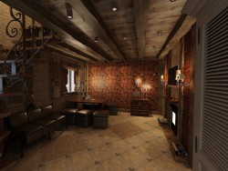
3D visualization Design project of a water cooler for office


3D-work specification:
| 3D-editor | 3d max |
| Renderer | vray |
| Time expended on work | — |
| Time expended on render | — |
| Polygons | — |
| Publication date |
 3
3
 9
9
Send
Deleted user
For an office with dark walls, white color, as it seems to me, is not very suitable. Maybe metallic or black gloss would look richer.
Для офиса с тёмными стенами белый цвет, как мне кажется, не очень то подходит. Может металлик или чёрный глянец смотрелся бы побогаче.
Reply
Translated from ru Show original
Ozzyzy

And there is! Thank you for noticing. On visualization (as a result and in the realized project) a light gray tone was presented, so that pure white would absorb the reflection of dark walls. But in the selection of color on the spot had to add a percentage of 8% of beigeish-yellowish. The trouble with this jewelry selection of halftones is the difficulty of re-matching the color in case of restoration or lack of paint. It is much more convenient to operate with ready-made paints from catalogs, but not always and they suit in the end!
Так и есть! Спасибо, что подметил. На визуализации (в итоге и в реализованном проекте) был представлен светло-серый тон, так ка чистый белый вбирал бы в себя отражение темных стен. Но в подборе цвета на месте пришлось добавить процентов 8% бежевато-желтоватого. Беда такого ювелирного подбора полутонов - сложность повторного подбора цвета в случае реставрации или нехватки краски. Гораздо удобнее оперировать готовыми красками из каталогов, но не всегда и они устраивают в итоге!
Reply
Translated from ru Show original